SPE Capital
Brand Strategy, Brand Visual Identity,
Brand Culture
Brand Strategy, Brand Visual Identity,
Brand Culture
Embarking on the next phase of their journey, we created a new identity for SPE Capital designed to signal a new era of growth. Every process undergone by the entity goes through various phases, an these phases always go full circle. This is why we make use of circles in our logomark, which ultimately represent the entity’s partners. Our logo seamlessly portrays the essence of what they do as a brand by highlighting their collaborative nature and their support in investment opportunities, while putting themselves right in the middle of it all.
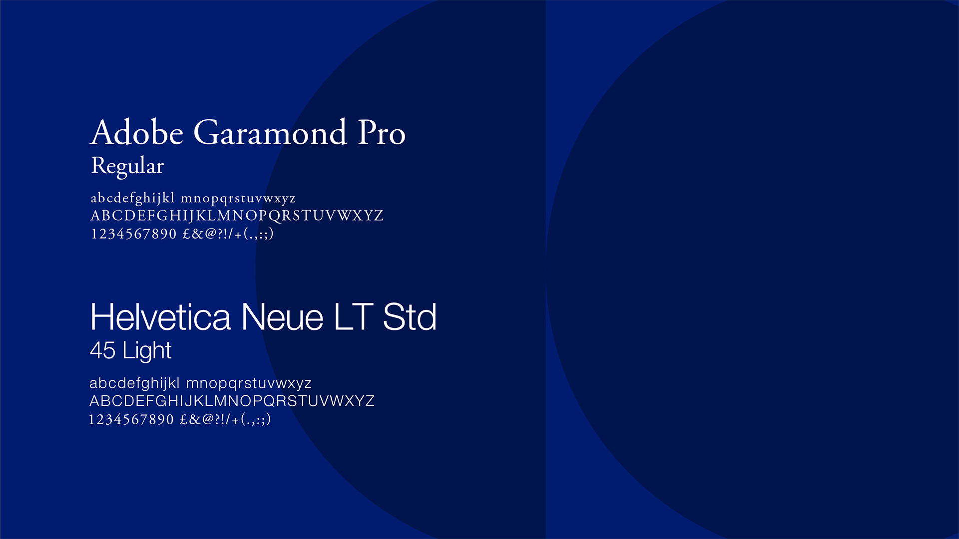
To complement the logo, we also carry the brand’s progressive and collaborative essence throughout the visual language, felt and seen at every touch point of the brand’s visual identity.